Per-Home Usage Analysis with Time Series
This article explains the technology behind our usage reporting.
- Per-minute energy consumption data is converted to Python Series and Dataframe data structures indexed by date and time. The resulting Python Time Series structure allows flexible processing on any aggregate frequency such as per-hour, per-afternoon (and thus per-morning, per-evening and per-night), per-weekday, per-week and per season (winter, spring, summer, fall).
- Weather data can also be represented in Time Series data structure and thus can be used to compare energy usage against the temperature on hourly-basis.
- A histogram of per-minute usage is always found to be multi-modal, with #of modes being 4. This distribution aligns well with the classes of appliances found in US homes, divided by the power consumption and category: Small appliances, Kitchen Appliances, Airconditioner and Heavy appliances such as electric range.
- Data for all homes is read and a summary file is created listing each home's characteristics (square footage, #of stories) and energy usage (total, per-season, per-appliance class and more).
- The charts are created with Matplot library (credits to Hunter 2007).
Comparative Statistics and Custom Messages
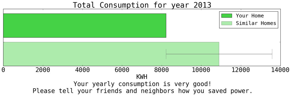
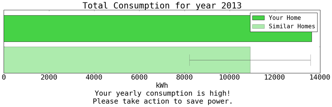
- The goal of the energy dashboard is to present to a home owner a compelling story about his/her usage that leads to behavioral change of reducing the usage. Such story can create an impact only if the usage is presented in a proper context. Our choice of the context is the average usage of similar homes in same city.
- We define the similarity of homes by total square footage and number of stories. So for example, two-story homes with square footage 1800-2500 are all considered similar and their context is average usage among them.
- Python script reads the summary file created from analysis of all homes and computes mean and standard deviation on each category of homes. A second pass through each home's usage data compares each home's usage data with average usage data and computes z-score of each home. Each home's usage is labelled as "Very Good", "Average", "High" and "Excessive" according to the z-score.
- The labels also lead to custom messages on the chart to encourage the specific behavior. For example, home owners with "Very Good" usage are told "Your usage is very good. Please tell your friends and neighbors how you saved energy."
